
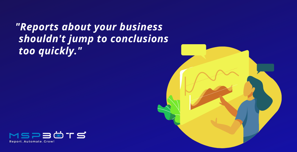
The way you interpret and utilize your data can steer your business into your desired outcome.
It’s why you set up analytics tools in the first place: to track your metrics and make reports out of them. But how far will these tools get you when the data that you get from your charts, graphs, and maps aren’t interpreted correctly?
Let’s go through the common mistakes you can make when interpreting data.

Mistake: The Survivorship Bias
The “survivorship bias” is about looking at data variables with a preference for successful outcomes.
As described in Abraham Wald’s study of World War II airplanes, the army began their task by reinforcing the most damaged parts of the planes that returned. They soon learned that it was important to gather insight from the planes that didn’t make it back as well since those planes showed which parts actually needed reinforcing: the cockpit or the engines.
How to overcome it: Choose from a wide range of datasets
It may be instinctive to focus on the aspects of your business that are doing well and then figure out where to go from there. Countering the survivorship bias requires a conscious effort to pause, review, and assess whether the positive data you have is the expected outcome or an outlier.
It’s important to be mindful of your data sources. A wide range of datasets is helpful to begin with because you are not limited by the reports you can acquire. From the various reports, assess which datasets will give you the entire picture and run them in data visualization tools to help you analyze clearly.
Mistake: False Causality
This logical fallacy assumes that a certain result was caused by an event that occurred before it. It can be translated from the Latin term post hoc, ergo propter hoc, which is “after this, therefore because of this.”
In other words, most overlook the possibility that two things may only share a correlation and aren’t necessarily connected.
How to overcome it: Customize your data visualization tool
Instead of immediately assuming causations, test how your data affect each other by seeing the numbers in one comprehensible dashboard. When you can plot your widgets from your datasets and arrange them in a way that makes sense to you, you gather more insightful conclusions.
Mistake: Overfitting
Overfitting is creating a model that’s too tailored to the data available and not representative of the general trend. This occurs when someone wants a more thorough report.
While a complex model can explain existing data, random variations are going to be difficult to take into account. It then becomes harder to predict future trends.
How to overcome it: Configure your data visualization tools
One way to prevent overfitting is to maximize the configurations of your data visualization tools so that data values are presented in ways you want it to be. For example, in creating a line chart widget, you can set goals, dimensions, trendlines, and many other indicators to showcase your data appropriately.
***
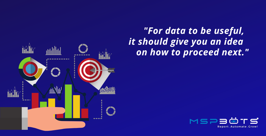
Ensure that the huge amounts of data you collect are useful for you and your business. Avoid making interpretation mistakes by getting the right tools that keep you well informed.
Kickstart your journey by signing up for a free trial or by booking a demo with us.

